TeamEXOS Coach Hub
Role
UX/UI Designer
Research
Information Architecture
Interaction Design
Challenge
With EXOS's new member-facing, B2B digital experience already moving into development we were given an aggressive deadline to deliver its sister application where coaches can manage the members that they would be interfacing with. We needed to deliver an MVP that would allow for basic member data recording (coach consultations) and the ability to make data-based decisions. This deadline meant we could not perform a true end-to-end design process and had to forgo deeper exploration into the problem space before solving for our coaches' problems and needed to rely on our understanding of the problems from our past Coach Hub research.
Design principles
Getting started I developed a few principles with my team to guide us and keep our focus on the scope.
Simplicity throughout - Intuitive experiences that facilitate seamless interactions.
Empower the coach - Provide optionality that supports the user's path to finding and creating what is needed.
Enhance connections - Establish trust by providing data insights that will build relationships through an understanding of previous behaviors.
Hypothesis
Giving coaches a way to learn from data and capture data will lead to a better coaching experience for the members and provide the coaches with more member engagement.
Product thinking our solution
Without the opportunity to explore our problem space I set up a workshop so my team (Product Manager, UI Designer, and Performance Innovation Lead) and I could take a product thinking approach and make sure we understood the jobs-to-be-done of our coaches. Since we have prior experience building a (much larger) Coach Hub application, I didn't want to get caught up in including more features than we actually needed for this MVP. This allowed us to take a step back with clear minds and make sure we were including the right features to achieve the coaches' goals.
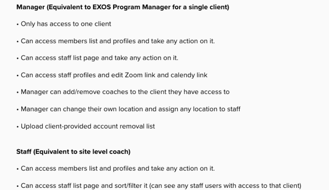
Leading us to conceptualize the needed features, preliminary data points, preliminary requirements, and user permissions.
Defining our problem-solution-fit
Vision (why) - Without these capabilities coaches will be much less efficient at delivering services and managing relationships.
Strategy (how) - By enabling the coach with a simple and intuitive data-rich experience to reduce time performing operational tasks and empowering them with a way to learn a member's story enabling them to be a better coach.
Goals (what) - Coaches will have a bigger impact on the lives of their members increasing member engagement with our services.
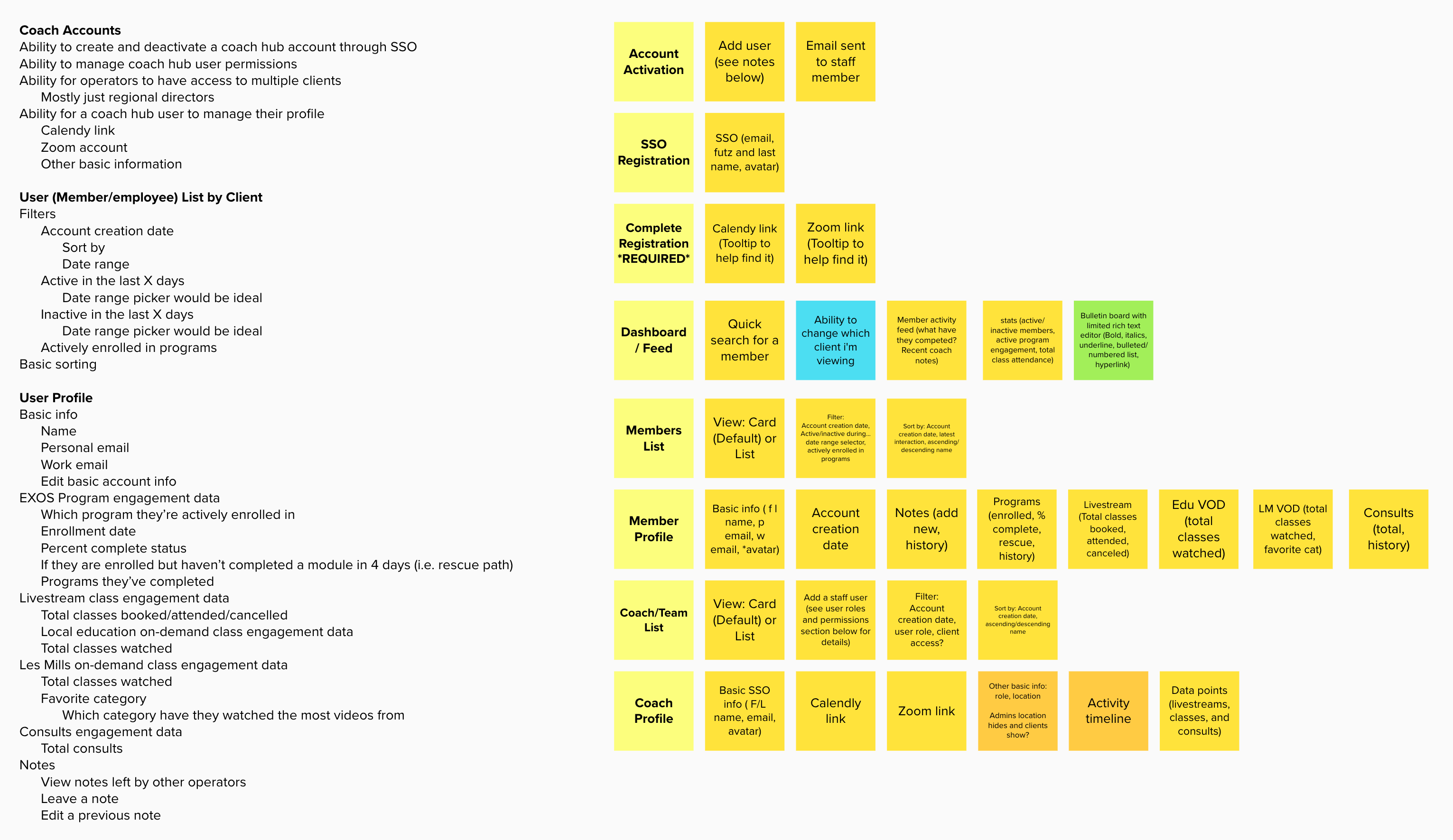
Conceptualized features architecure, requirements, a permissinos from our workshop.
Discover essential data
In order to provide the coaches a way to streamline learning about members and spend less time performing operational tasks, we needed to make sure we were displaying the correct data they wanted to see. To gather their insights we sent out a survey to over 200 coaches receiving 85+ responses in 5 days. In the survey, we sought to understand what data they found most important for a member profile, the client dashboard and asked for any additional insights they felt would improve the Coach Hub experience.
Top 5 most useful member data
- Last 3 activities completed with timestamps.
- Notes about pain.
- Most frequently attended class.
- Total livestream classes attended.
- TIE - Average # of workouts/week.
- TIE - Total consults completed.
Top 5 most useful client data
- Bulletin board with announcements.
- Total number of active members.
- Average attendance across all classes.
- Recently registered (new) members.
- Average number of workouts completed by active members.
Building for data and interaction
Now that we had the clarity to move forward with our solution I began sketching ideas before moving into building out the wireframes and interactive prototype. This allowed me to explore many different interaction models of how to organize the data and note-taking content providing us context into how the interactions, information architecture, and visual styling would all work together.
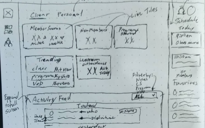
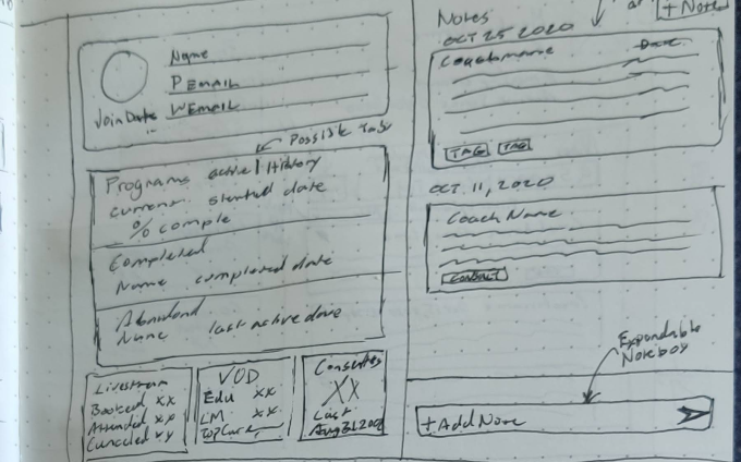
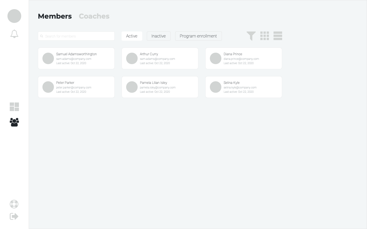
Sketching ideas and inital wireframes of the client dashboard, member profile, and members list.
Testing and further refinement
After we weighed many of the different interaction models we were ready for some usability testing with the interactive prototypes. We chose to start by conducting 10 unmoderated tests using trymyui.com of 2 different prototypes (5 each) for the note-taking feature since my team was split on which one to move forward with. We set up the users with a scenario where they needed to perform the task of leaving a note for the member. Allowing us to learn which prototype performed better as our users were completing the task.
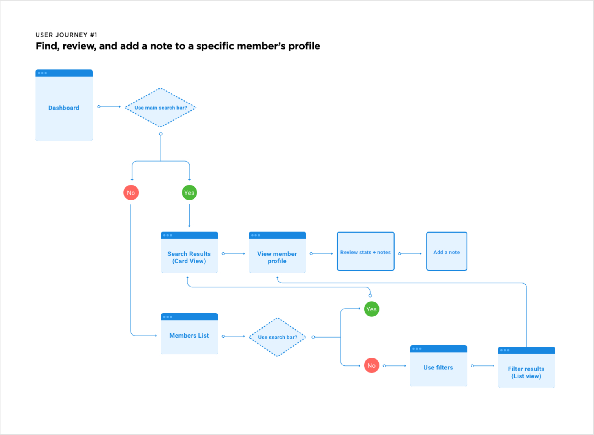
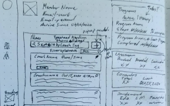
User flow for test and both note taking prototypes we tested.
Following the unmoderated tests, I made a few iterations we discovered to the layout my team and I agreed performed better. Then I set up another round of user tests with 6 coaches that had responded to our survey. In these tests I set up a scenario for them to perform 2 tasks, leaving a note for a specific member and looking into the data to learn about another member. Overall feedback was positive, our users completed the tasks mostly with no issues and felt the flow to find a member, leave a note, and understand what they have been doing was simple and straightforward.
Of course, a few iterations made themselves clear during the testing along with the coaches' feedback provided us a better understanding of how they look into member and client data.
A few iterations from our testing:
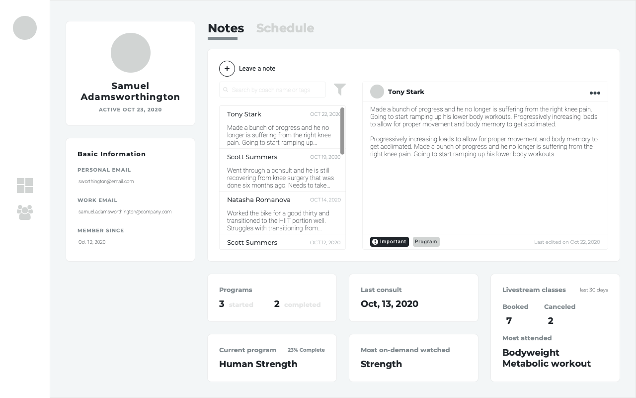
- Separated the notes onto its own page to provide more space for a better note-taking experience.
- Renamed pin note to flag note which had a better fit to its functionality and adjusted the interface to better signify flagged notes in the saved notes column.
- Reorganized the layout of the data points based on feedback on the member profile and client dashboard.
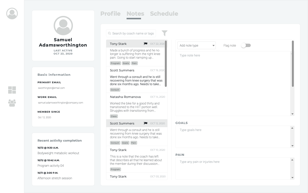
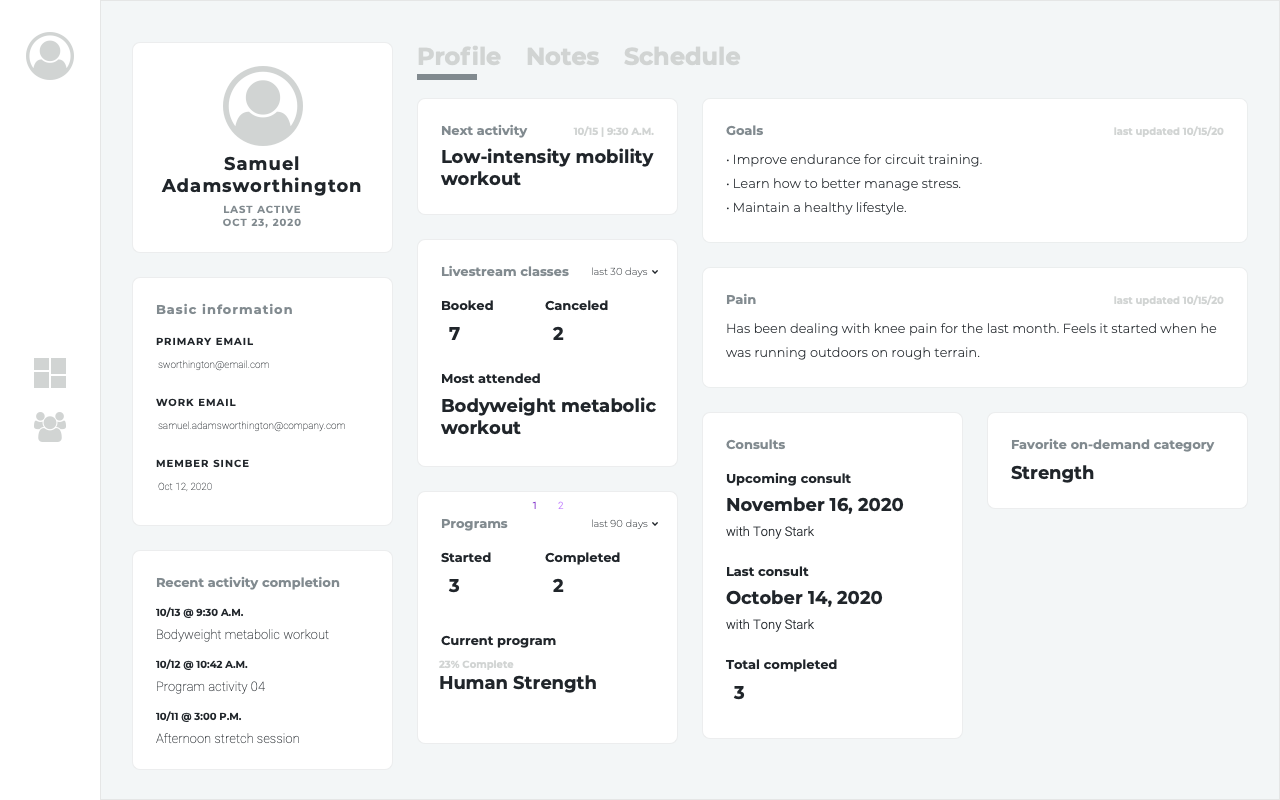
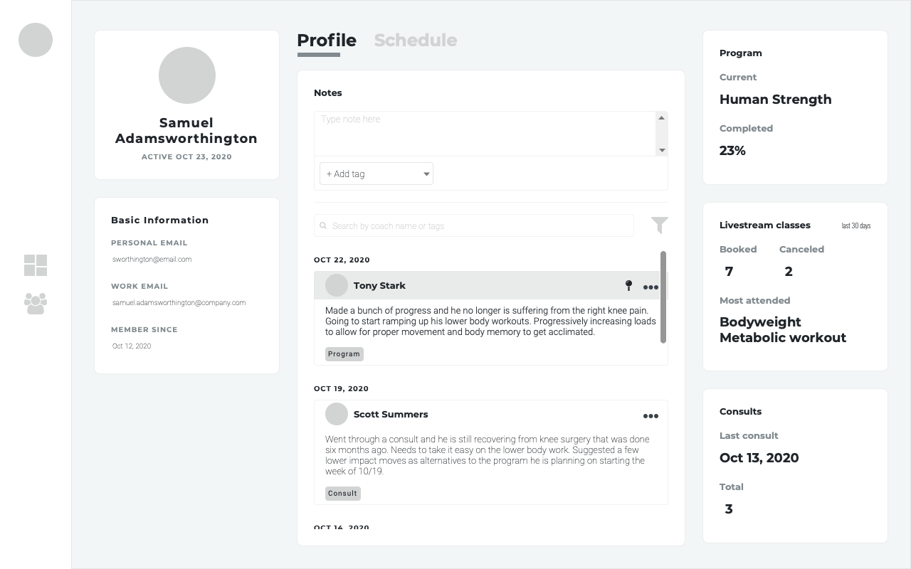
Final wireframes for member notes and profile pages.
Refine and polish
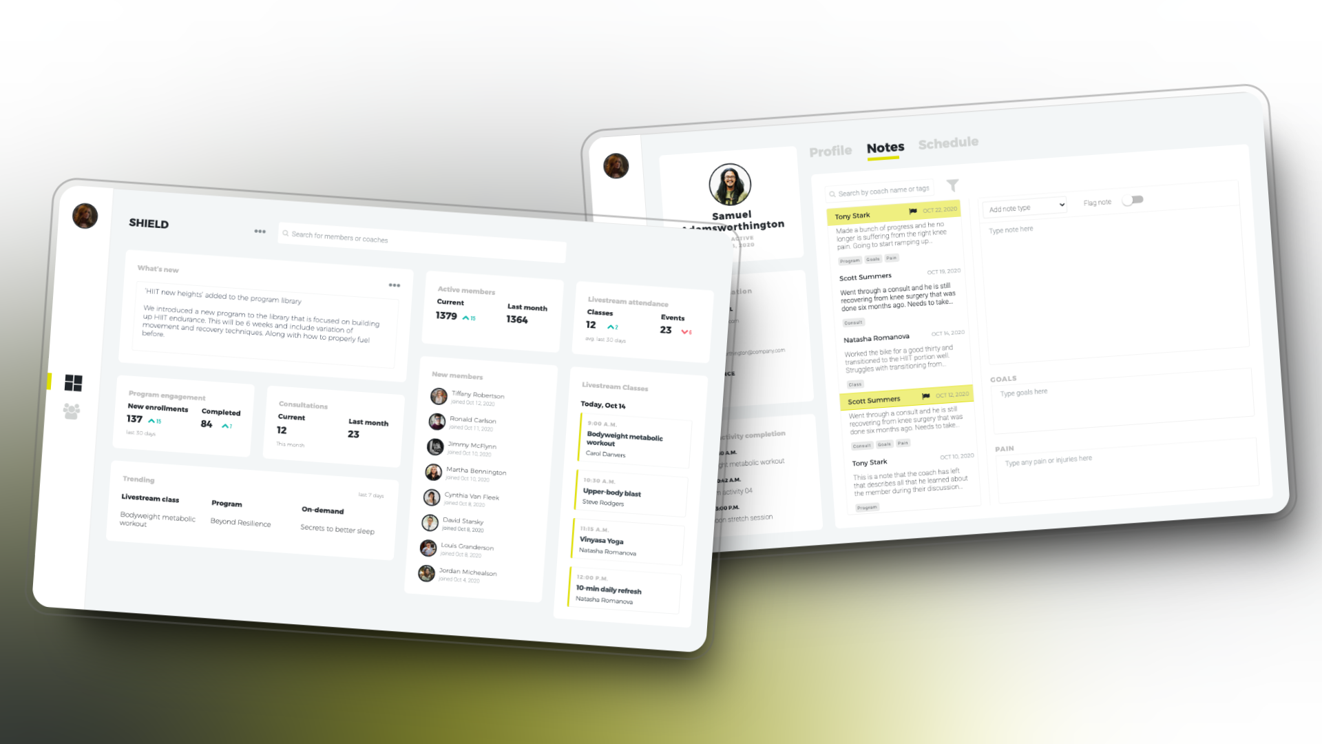
With our testing leading to a better user flow for the coaches to quickly find what they needed I began working closely with the UI designer to polish the interface design layout, components, and style to align with our brand guidelines.
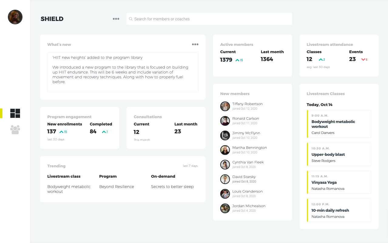
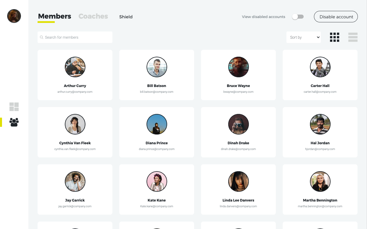
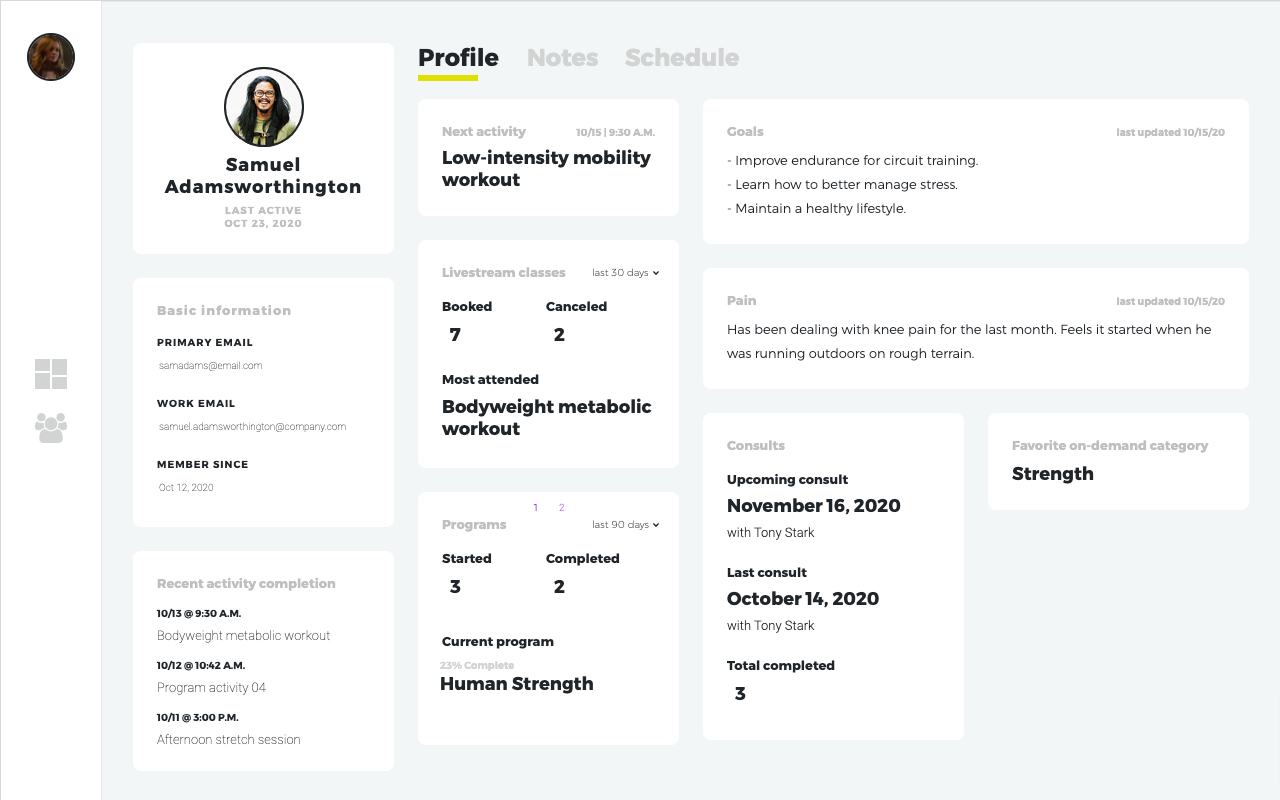
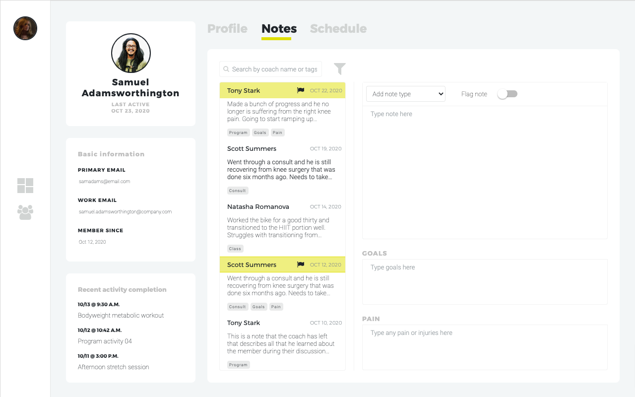
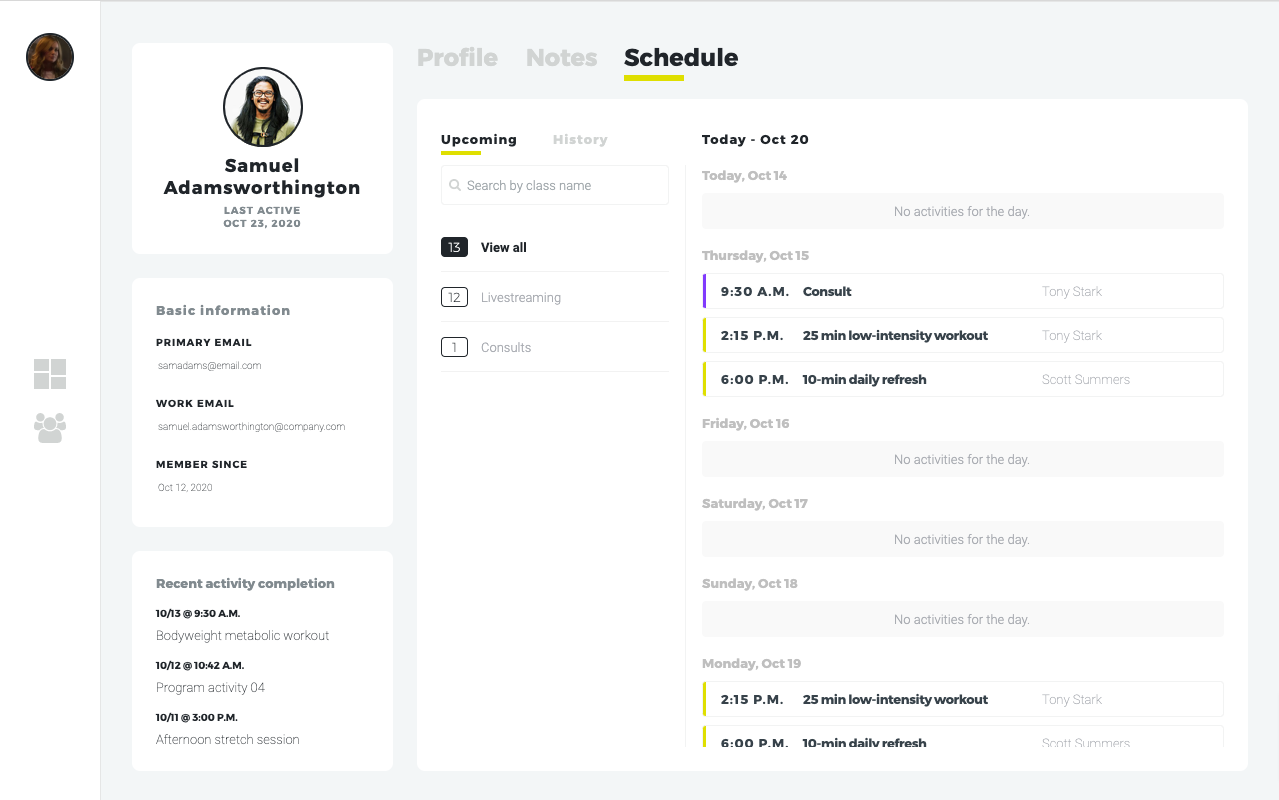
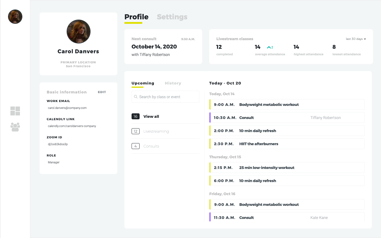
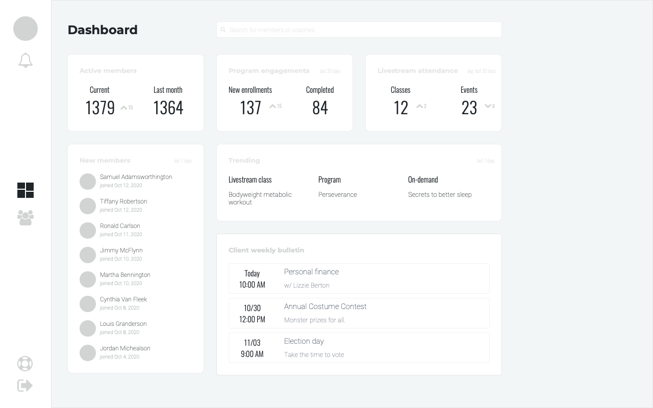
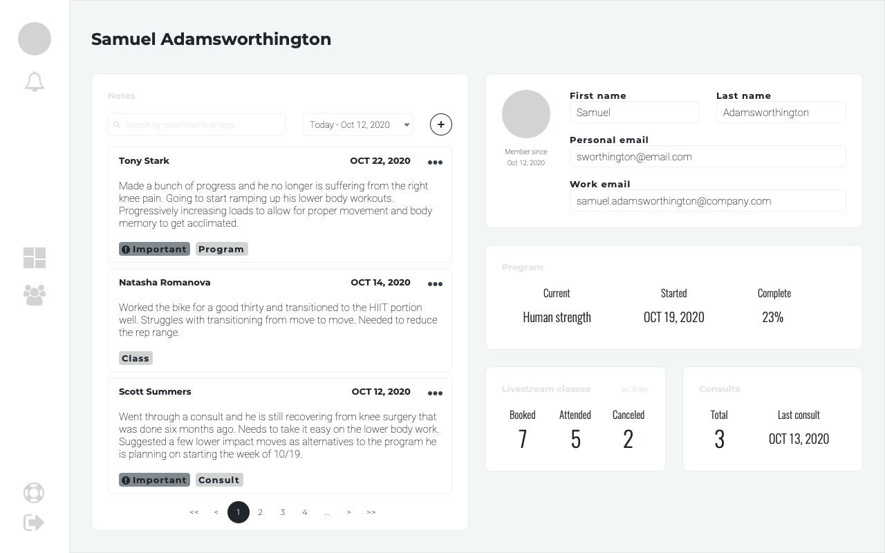
High fidelity designs showing the client dashboard, members list, member profile, notes, schedule, and coach profile.
Reflection
Using a process that allowed us to discover our solution through product thinking, qualitative research, usability testing, and several iterations, I was able to collaborate with my team and deliver an MVP that allows coaches a simple way to quickly capture notes about a member and provide a better coaching experience by learning their member's story through relevant data.
We needed to make a few difficult decisions to limit some features but we know these will be great additions as the Coach Hub continues to get built into the robust application that it will become. Continuing to improve the coaches' ability to build relationships and facilitate their operational tasks so they can spend their time doing what they do the best — Coach.
Releasing in Q3 2021