Fitness Facility Kiosk
Role
UX/UI Designer
Research
Information Architecture
Interaction Design
Overview
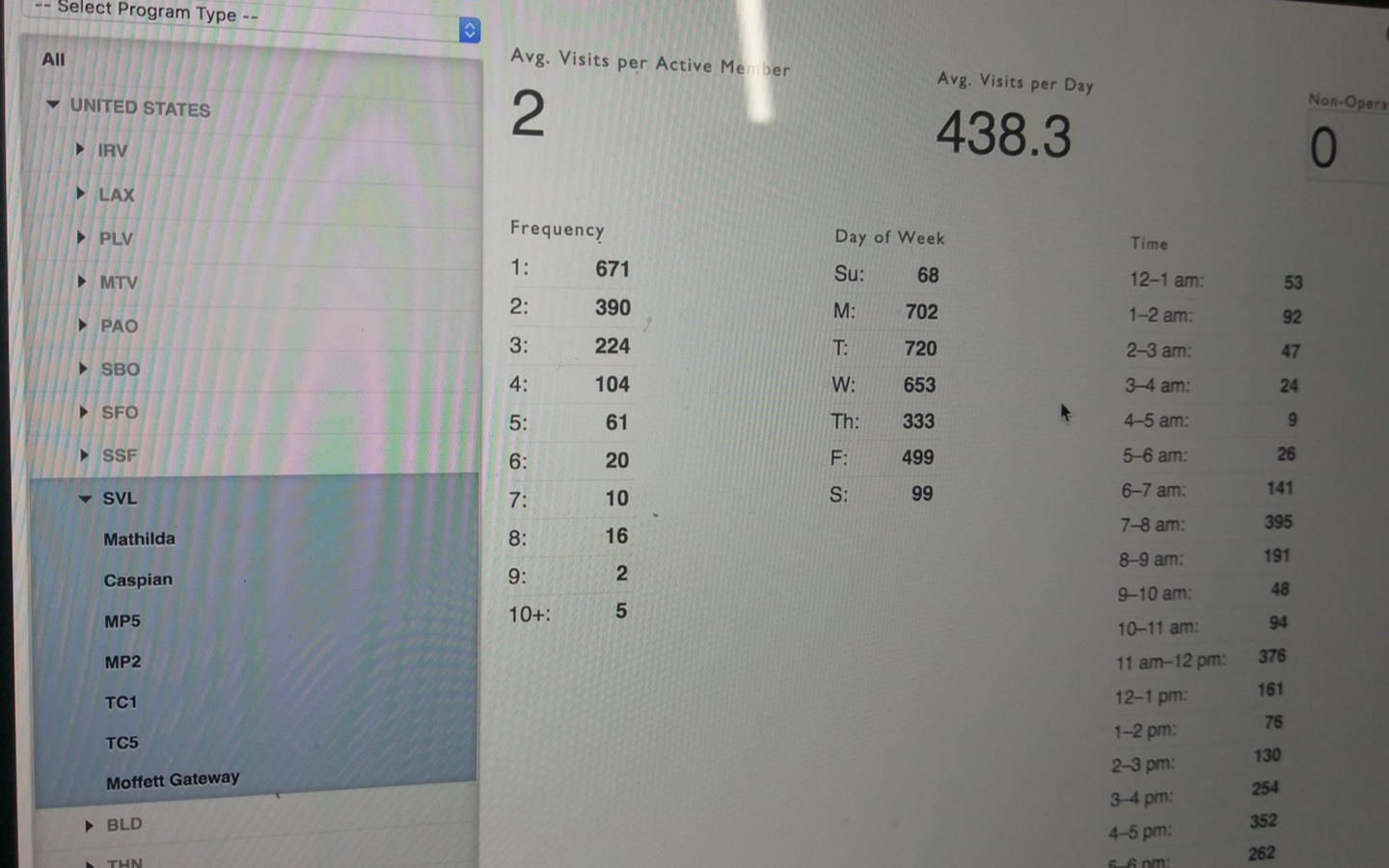
Fitness facilities that are managed by EXOS require their members to check-in before using the facility, except many members do not check-in. Resulting in unreliable data used for reporting the number of members using the facility and the times it was being used.
Challenge
There were many factors that led to low member check-in compliance. With a few being that corporate clients provided the fitness center as a free benefit so employees did not see a point as to why they needed to check-in, many facilities do not have a staffed front desk, and the kiosk location was in hard to notice areas. With an understanding of the limitations we faced (new hardware and a new service design were not part of the scope) we set out to improve the check-in compliance through a more noticeable and engaging check-in kiosk.
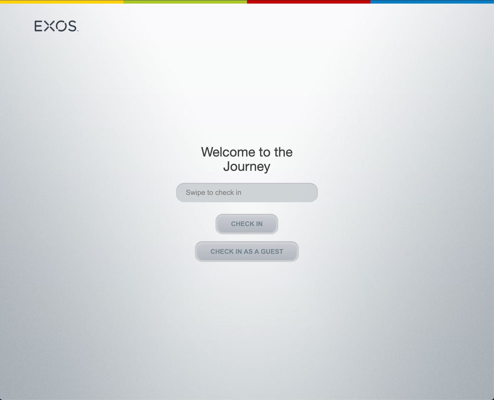
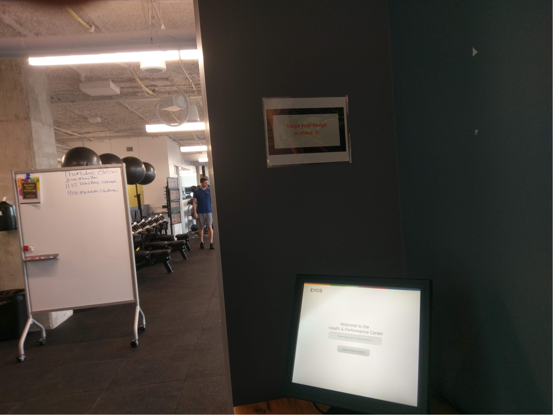
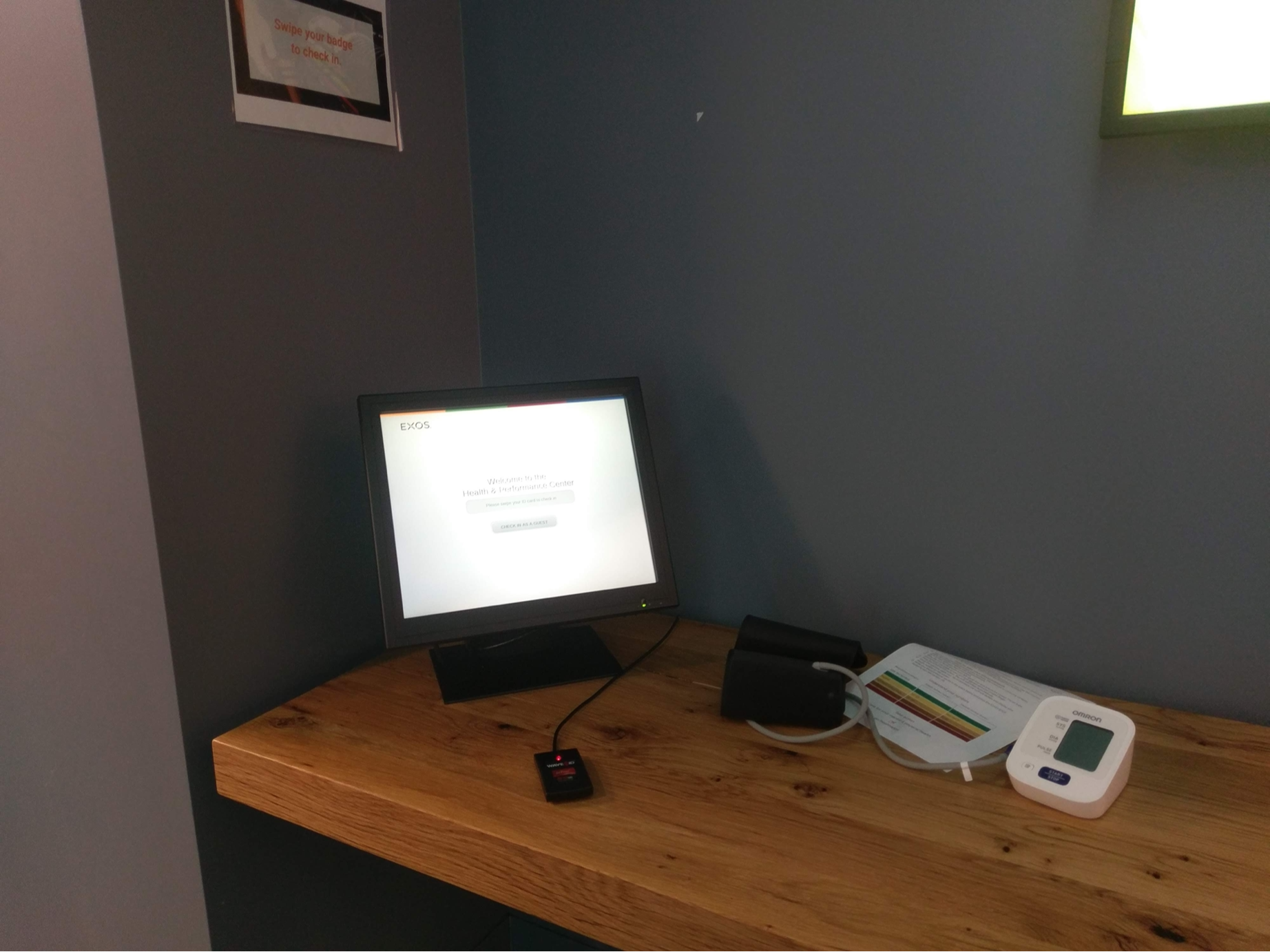
Original kiosk interface.
Design principles
Before getting started I developed a few principles to help guide and align the team.
Create value - Encourage engagement with integration that facilitates user behavior.
Make it seamless - Reduce friction to establish confidence.
Bring attention - Entice through visual delight.
Problem hypothesis
Check-in compliance will only be greater based on the incentives given to the members.
Research
With an understanding of some of the main issues causing poor facility check-in, my product manager and I conducted a few facility visits to see how the kiosk was set up and observe any member interaction with them. Along with this, I conducted interviews with 5 program managers to get a better understanding of the ways they were managing reporting with unreliable check-in data, dug into a few facilities check-in data to compare to real numbers collected through these methods, and how first-time employees registered for the facility.
Having these conversations led me to discover the frustrations program managers face when doing reporting, observe poor kiosk location set up, and become aware that the registration process for first-time employees was a confusing run-around experience.
Discovered insights
The kiosk location was hard to notice and there was little to no signage to help guide members to check-in.
Most manual tracking was done on multiple sheets of paper.
Confusing system messaging for unregistered users would make them believe something went wrong and they would skip check-in.
Unregistered employees couldn't complete their registration at the kiosk without assistance from a staff member.
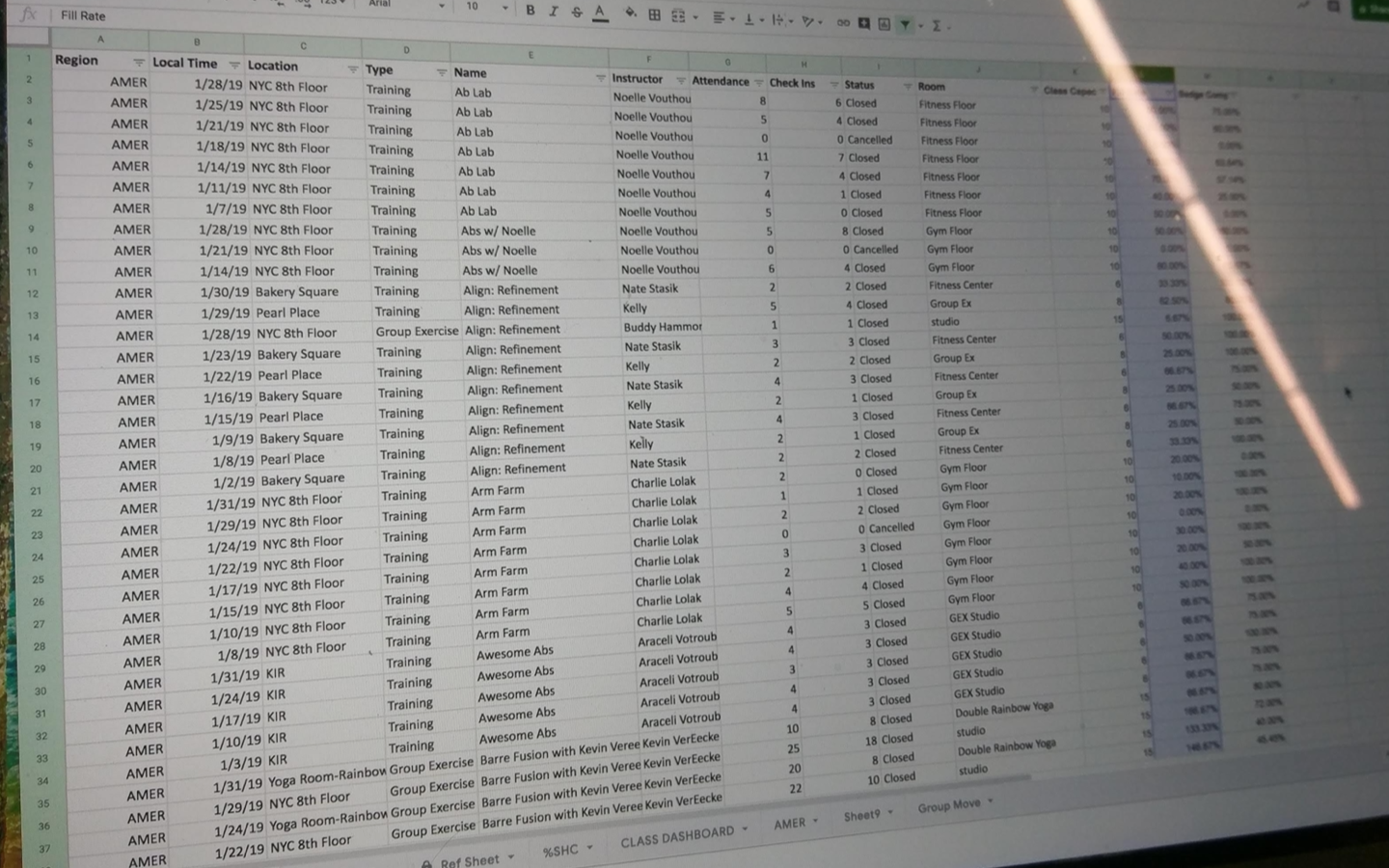
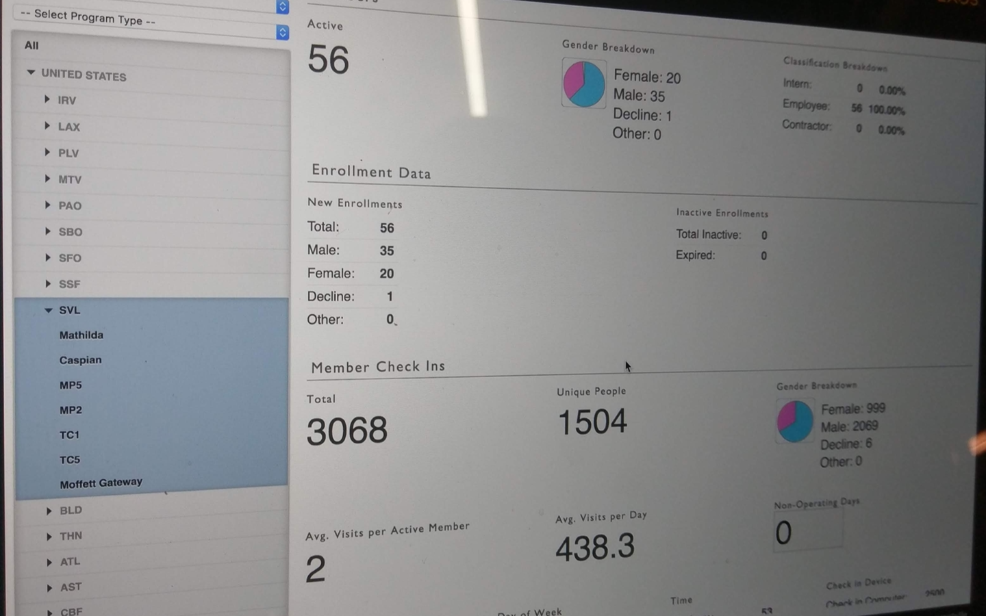
Images of how coaches were tracking check-ins, reporting data, and how a kiosk was set off to the side in a facility.
Design solution
After synthesizing all the insights from our qualitative data I began to ideate the features and functionalities.
I would focus on:
- Enhancing the visibility with an "eye-catching" subtle animation to draw peripheral vision.
- Display the upcoming class schedule giving members another reason to look.
- Make it more useful by allowing members to check-in to upcoming classes.
- Include a way for unregistered employees to complete registration.
Problem hypothesis reframe
Improved visibility and functionality will provide members with a more useful kiosk experience that will increase check-in compliance.
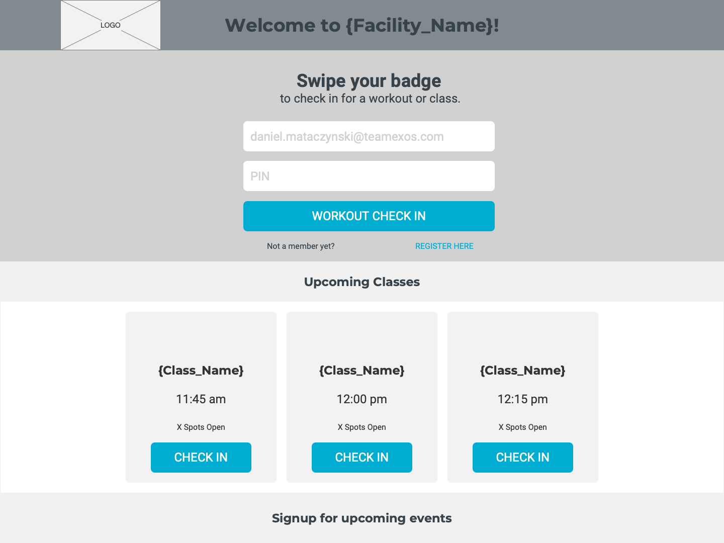
Early interface concept mockups.
Visualizing methods and interactions
After exploring multiple concepts, I narrowed my ideas down to build out the wireframes and interactive prototypes. During this process, I also had to design for the multiple different methods facility kiosks were set up for check-ins. These included a total of 12 combinations for touch screens, no touch screens, badge readers, and facilities with no classes. Having these built out provided us with more context into how these interfaces, interactions, content, information architecture, and functionality will all work together.
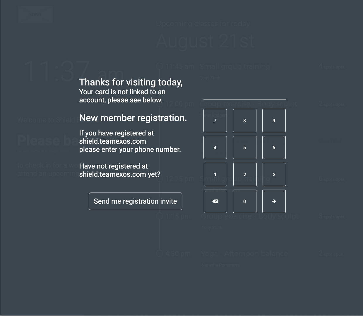
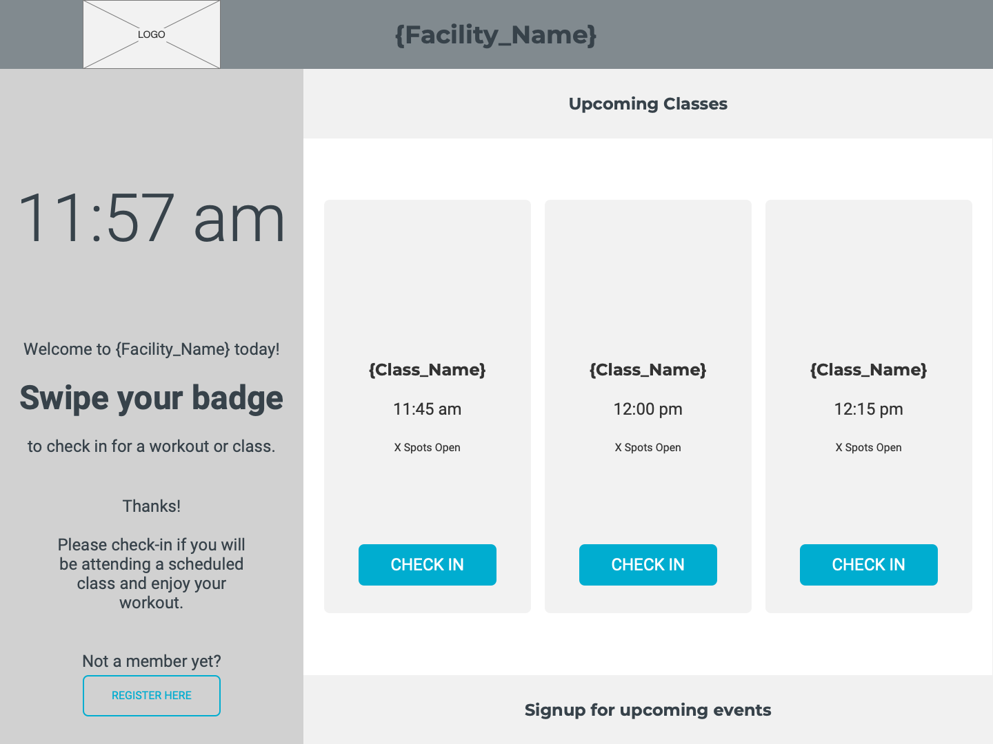
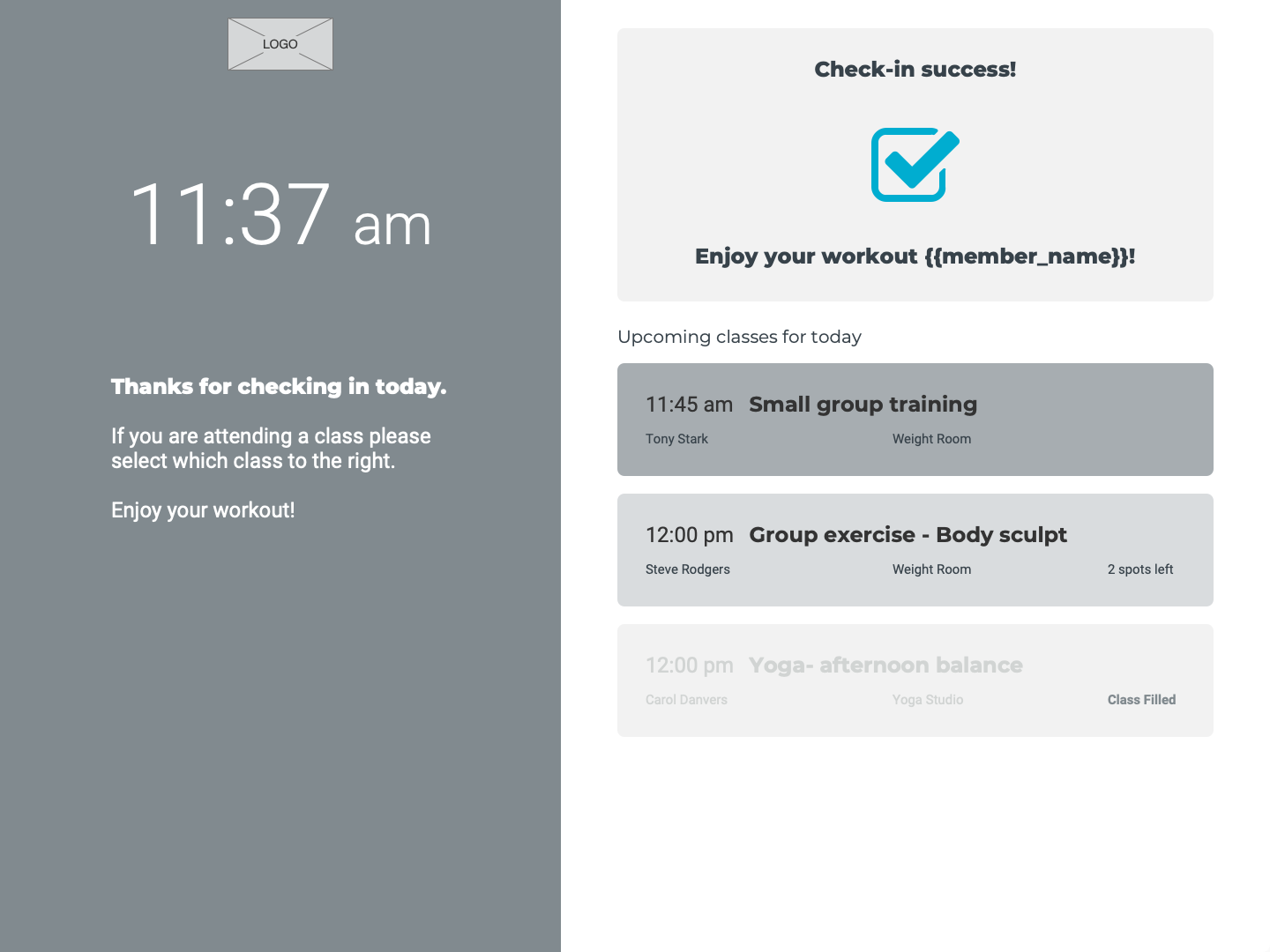
Initial wireframes for the home screen, class selction, and registration.
Testing the flows
Now that I had the interactive prototypes ready it was time to perform some usability tests. I used trymyui.com to set up 10 unmoderated usability tests where I designed 5 separate flows with 7 specific tasks. Our users were given a frame of mind and a scenario for each task they were asked to complete.
Most of our testers were able to complete all 7 tasks with no issues. They expressed a sense of clarity and ease to the flows they had to go through while completing the tasks. Although they were able to complete the tasks and expressed overall positive feedback, their experiences allowed me to realize a few areas needed some more refinement. I iterated the registration to have a better-streamlined flow, reduced the amount of copy throughout the registration flow, and removed the check-in option for a general workout.
Finishing style refinements
After completion of the usability iterations, it was time to style the interface in an attractive attention-getting way. I worked together with the UI designer to refine the interface components and make a final decision on the background animation. We agreed on a subtly shifting gradient animation would give a nice visual touch to catch the eye without being too distracting.
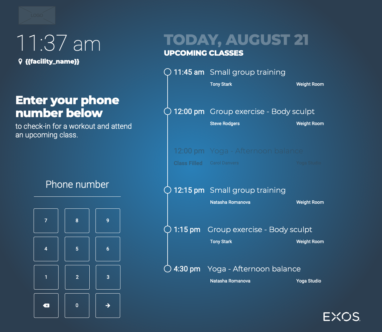
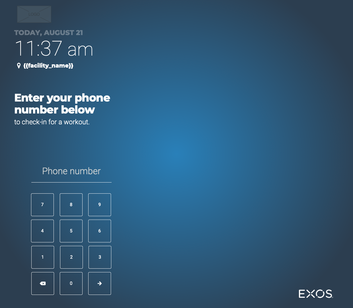
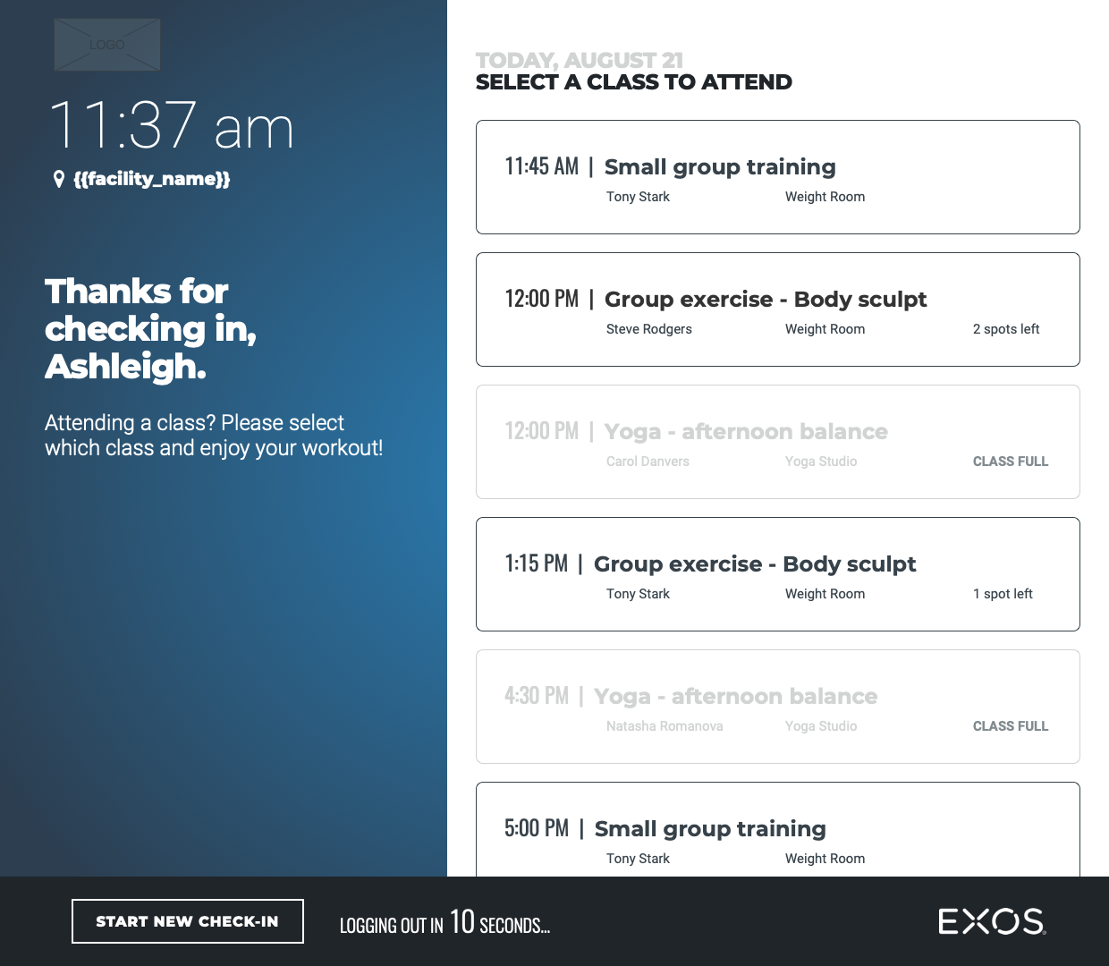
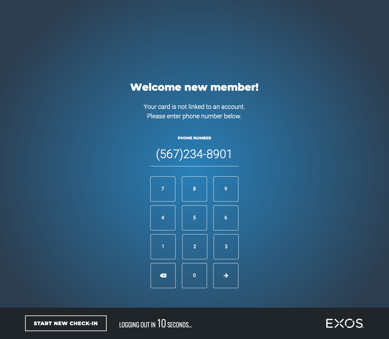
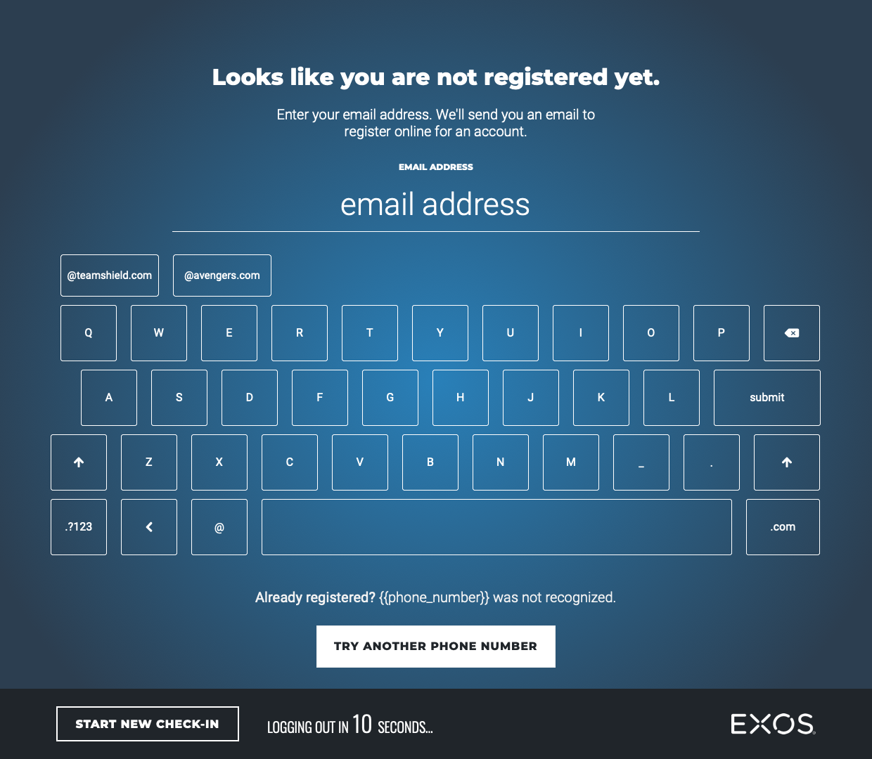
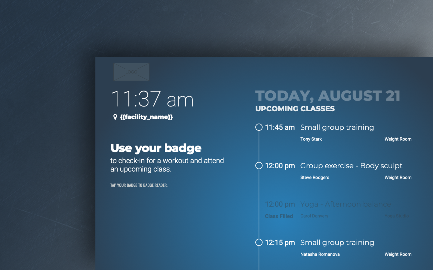
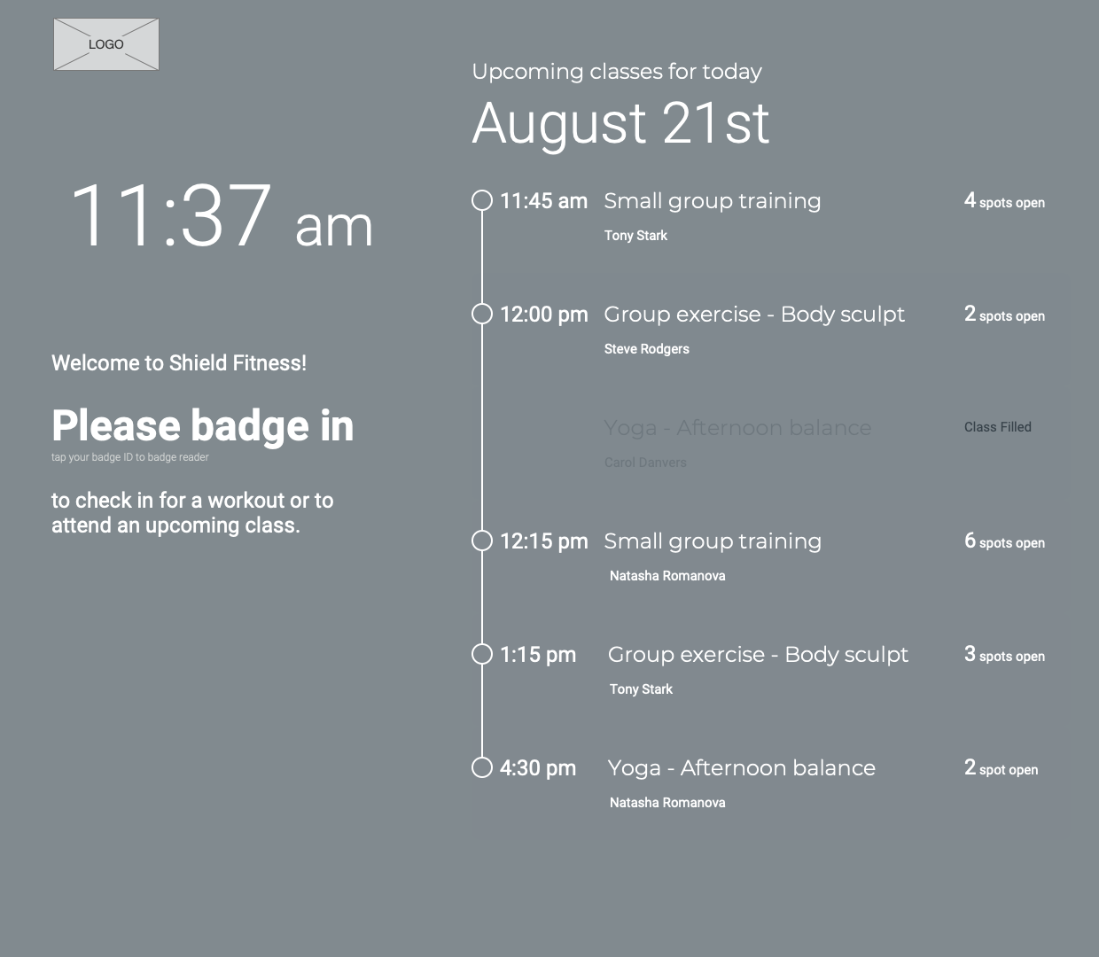
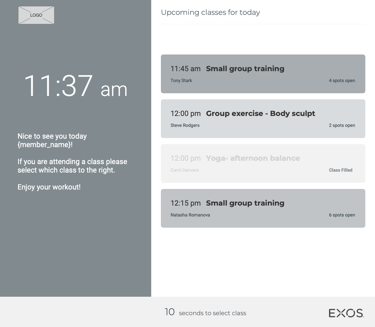
High fidelity designs of the home screen variations, class selection, and registration pages.
Outcome
Being able to work through my design process of qualitative research, ideation, usability testing, and iteration, along with team collaboration we got to deliver a completely new fitness facility check-in kiosk experience. Providing more value and attention with support for multiple user flow experiences.
- Increased visibility with an eye-catching animation.
- Gave members another reason to look by displaying the upcoming class schedule on the home screen.
- Made the kiosk more useful by allowing members to check-in to upcoming classes.
- Added a way for first-time unregistered users to complete registration.
Fitness Facility Kiosk was set to release Q3 of 2020 but due to the COVID pandemic, EXOS pivoted to a completely new digital fitness experience and decided to shelve it to have the team's full concentration on the new business direction.